Express Kidz / The Gluvits
June 28, 2020
Big Lots!
January 10, 2022On Ice there are no disabilities.
Indianapolis Disabled Hockey is an organization that is bringing the joy of playing hockey to the disabled. Sled Hockey is an action packed sport similar to Ice Hockey with a couple of differences. First, players sit in a “sled” with 2 blades. Second, players have 2 smaller hockey sticks, one in each hand. One end has a pick on it to help pushing around the ice. The other end has the blade for stickhandling, passing and shooting. Also, Blind Hockey is similar to traditional Ice Hockey with a couple of differences. First, the puck is larger and made of metal. Inside there are ball-bearings which make a lot of noise. Second, the net is one foot shorter. While checking is not allowed physical contact is permitted.
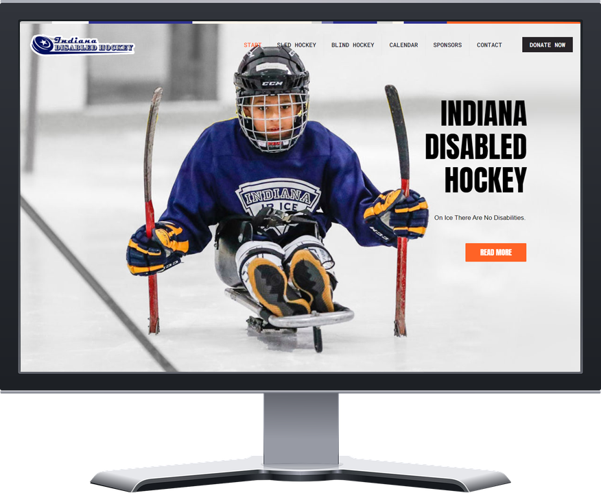
Indy Sled Hockey's new homepage
Indy Sled Hockey needed a new exciting website.
Due to the low content on the website it seemed like a good choice to convert the website from a multi page one into a single page site. I brought most of the content to the home page and used the main navigation menu to take you to different anchor points on the page instead of individual pages. Having a lazy load setting makes it run smoothly on mobile as well.
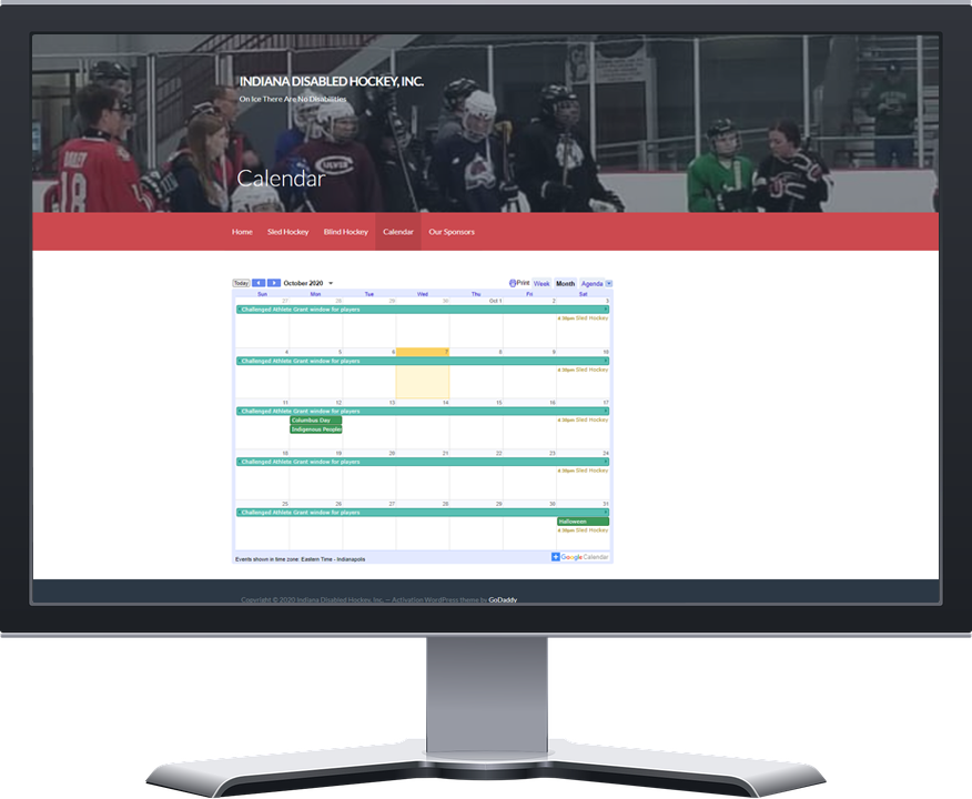
The old Calendar page is only an iframe link.
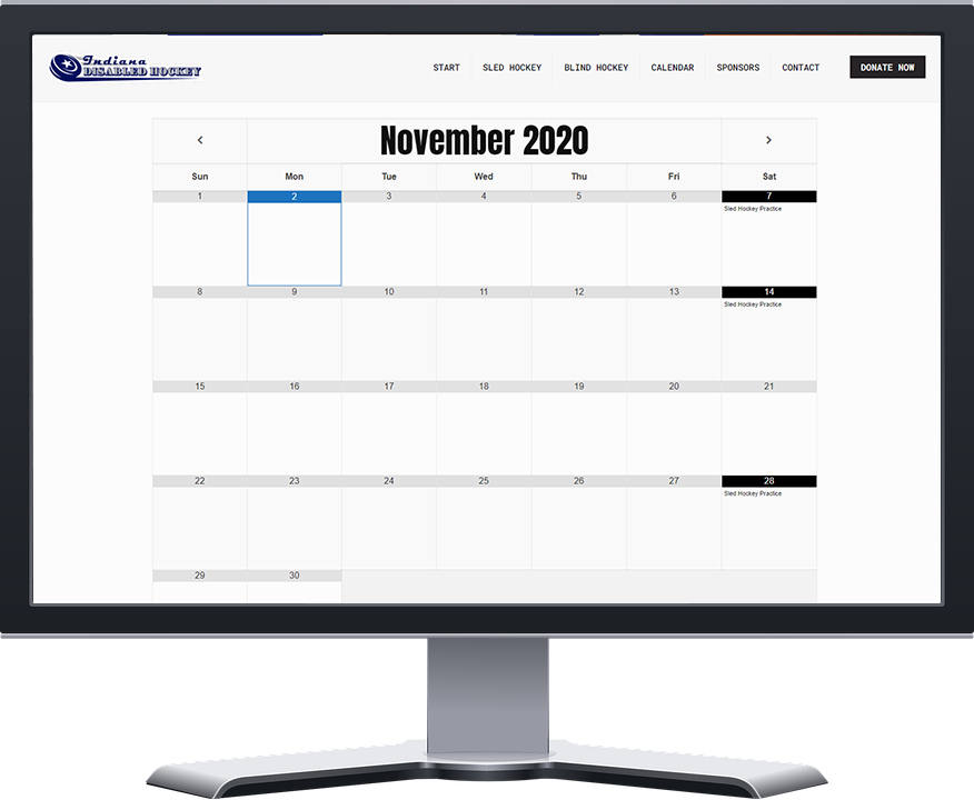
The new Our Calendar page Still uses Google Calendars but looks more in style with the theme.
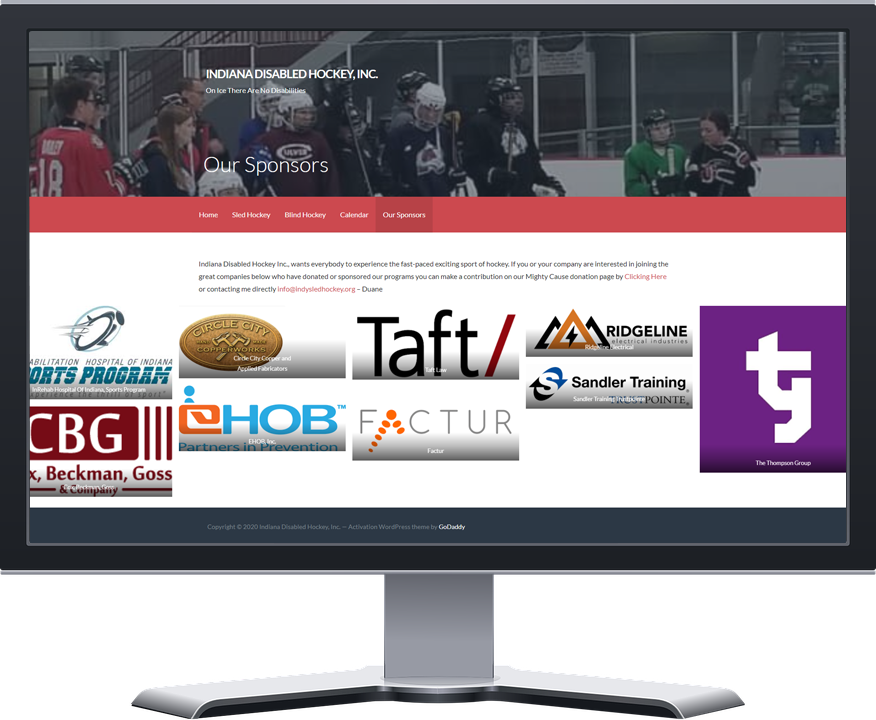
The old Our Sponsors page was random sized and various file types for the logos.
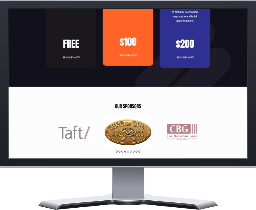
The new Our Sponsors area was added to the home page as a more interesting and interactive logo slider.
Logo and Style Guide Design
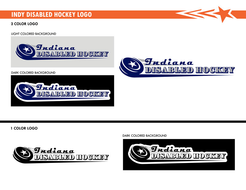
Indy Disabled Hockey, LLC. did not have any branding for the company. I created a logo and branding that felt like a hockey team and could be used on merchandise. I used their Steel Sled Hockey team logo and did research on other hockey team logos for inspiration. Some funky lettering on a stylized speeding hockey puck ended up being my favorite design. By adding the indianapolis star from the city flag and using the indy flag blue as the main color, I had my final design.
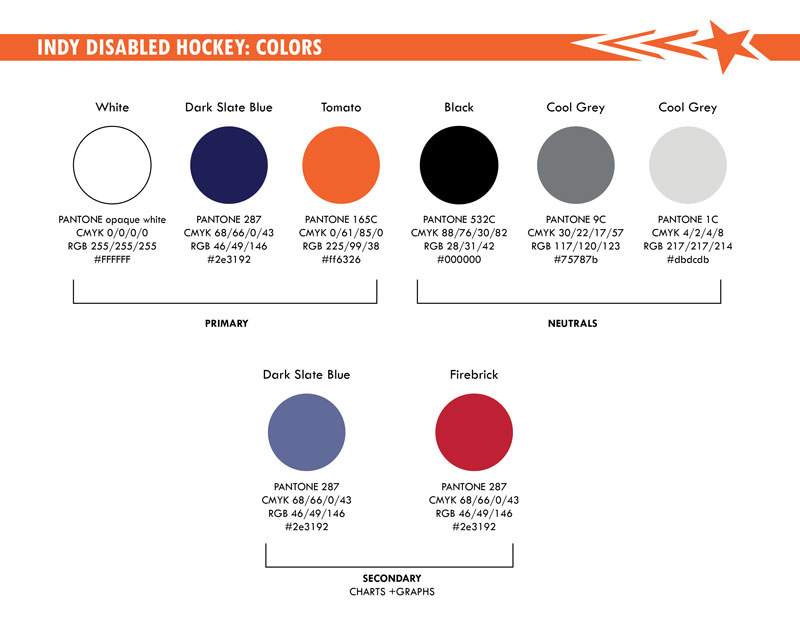
Besides building the logo and styling the website I created a branding style guide to keep all the content consistent from the logos, colors, and typography. There are instructions no matter where the marketing will be needed whether in print or online.

