David Lesperance Digital Environment Design
December 1, 2023
Learning GREP with InDesign
December 21, 2023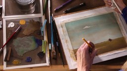
INSTRUCTOR: Mary Jane Begin
Completion date
December 3, 2023
Skills covered
Illustration
Course details
45m
Description
Tertiary colors are the neutral browns and grays that, when over used in a palette, are often referred to as "mud." Though sometimes banished from an artist's palette, they play a crucial role. Tertiary colors give more vibrant hues a chance to shine and play a starring role in compositions with more subtle ideas or moods behind them. Follow along with Mary Jane Begin in this installment of Artist at Work as she explores tertiary color, its best uses, and the creative possibilities available with this palette. She paints a landscape based on a reference photo, and provides tips along the way about establishing a ground, adding texture physically or digitally, building depth, and making your focal points pop.
Mary Jane uses the following materials in this course:
- Arches 140 lb hot press paper
- Tube watercolors- Winsor & Newton Cotman brand
- Paper stumps for blending
- Pastels- a variety of stick and pencil forms (including Conte pastel pencils)
- Short, fat, fine-bristle Winsor & Newton #2 and #4 brushes (for scrubbing color off)
- Pastels- a variety of stick and pencil forms (including Conte pastel pencils)
- Sceptre Gold II sable/synthetic blend #3, #6, and #10 brushes
- Winsor & Newton Cotman brand 25 mm/1 in. flat brush (for washes)


